
When I am feeling creatively stagnant I like to doodle. I give myself permission to make bad art with no purpose other than what I like to call “getting the moths out.” (Rather like airing out a linen cabinet.)
I was watching my youngest son zoom through our small, but thankfully open-plan home. Dodging the toys, cats and cushions strewn across the floor. Dressed in one of his favourite rompers – a long-sleeved, long-legged zippered onesie with horizontal aqua and beige stripes. They reminded me of the unitard our high school art teacher asked me to wear as a model for his art students. I was a dancer in my youth and could hold interesting poses. The stripes helped show the movement of the poses.
I quickly sketched Finn bouncing around the house in simple shapes wearing the romper. I added the stripes, but in one of my favourite colours – a muted poppy red.
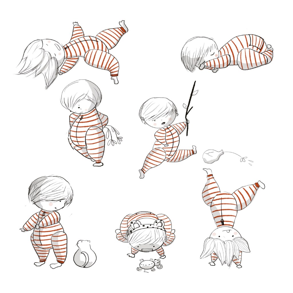
What a fun little character! I posted him to Instagram feeling refreshed. I like to show all sorts of process drawings and styles on my page as I consider it my digital sketchbook in a way.
Sitting for a moment to wonder what he was imagining in all these poses. Was he in space? Was the floor lava? Who was with him in his imagination?
After the storm of movement my son came to cuddle next to me, leaning in.
“Is that me?” he asked.
I nodded.
“Where are you?”
“On another page,” I answered.
Then he scampered off again, stirring the cat who was now sleeping beside me.
I left the doodle alone for a long while. I didn’t know where it would end up exactly.
The moths now flying free, I went back to creating B by Lexi Kareen. We had chosen to use greyscale illustrations for her novella to keep costs reasonable for her patrons. I was actually very pleased by how in-depth the illustrations were even without colour.
I had an idea it would work as I had always loved and appreciated the remarkable greyscale illustrations of Chris Van Allsburg.
Reorganizing my Procreate portfolio, I stumbled upon that doodly page of Finn. Side by side with the stack of illustrations for B, he looked sharp and fun.
I started drawing a black and white jungle with lots of plants and vines and hidden animals. Then I perched “Finn” onto the back of a cheetah — fully inspired by the life-sized plush cheetah that guards our front window.

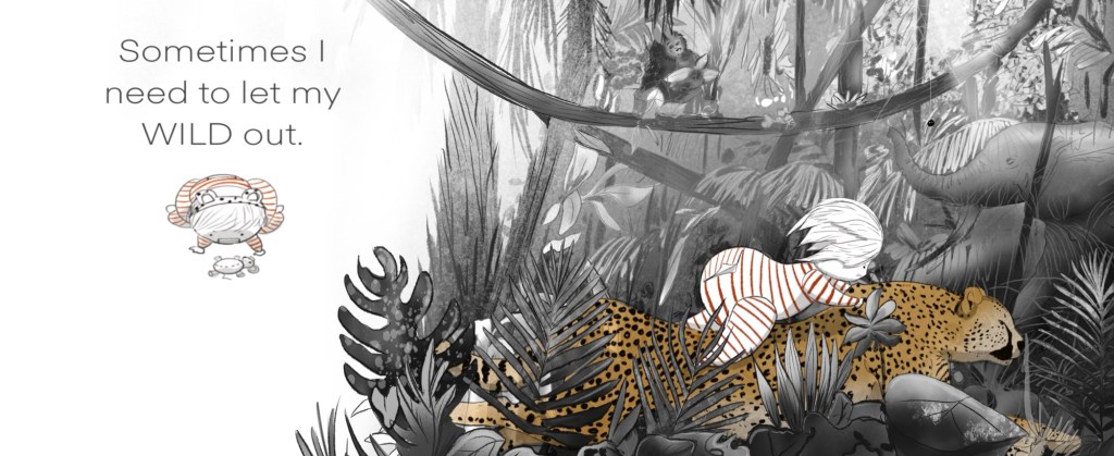
Now I was hooked. Where else could he be playing in his imagination? A construction site? A forest? A pond? The ideas were limitless. I added carefully chosen colours to highlight him, allowing the viewer’s imagination to fill in the rest for themselves. This was really neat. I liked it.
I thought about posting this too. Photo was loaded, caption written, a little piece of music chosen … but something told me to wait. I clicked the little x, and chose to view some of the many posts my friend likes to send me as her love language for me.
Three posts in, a post from Clavis Publishing popped up. Key Colors 2024 International Competition. I followed the link and read carefully through the criteria.
Unique illustrations. Check! I had those.
Not published. Check check!
Deadline. Two weeks. Yikes.
Now I needed a story. The illustrations already told most of the story so the text simply needed to support them.
I looked through the drawings I had already doodled, looking for the common thread. They were all about how Finn played. Sometimes he was actually quite quiet – drawing his own pictures. Other times he was a wrecking ball. Both styles of play are valid though, important.
After all – a child’s job is to play.
What a brilliant message to remind all the grownups about.
How else did my three children move through this world? Sometimes alone, sometimes messily and silly, sometimes with me, or my mom, or their dad, or friends.

Bit by bit the story started coming together.
I titled it Sometimes.
I couldn’t stop looking at the illustrations. I was so proud of them. This was by far my personal best work.
The deadline arrived. Uploading the files carefully to the Clavis site, I hit submit. Sometimes would have to sell itself now.
Months passed. Thankfully they were summer months, which seem to fly by here in Canada.
After the first day back to the school routine I received an email from Clavis.
“Your book, Sometimes, has been chosen as a finalist in our International Key Colors Contest.”
My heart leapt! A finalist?!
Weeks later the Clavis team met online with me and the other six finalists.
I was so dizzy with anticipation. They showed each book in great detail. The other illustrations were nothing short of incredible. They came to my book and everyone quietly exclaimed their awe for it.
Then came the final announcement.
Third. Second. Oh my goodness, could I have actually won this? First. Not me.
That flush of hot tears choked in my throat and I smiled through tight lips, congratulating the winners. I closed the app and let the tears fall freely. (Being fully supported by my puppet, Stella, and our dear old black cat.)
This was my best work.
Horrible tumbling thoughts rumbled through my brain. All those inner critics shouting their critiques inaudibly. “Your best wasn’t even close to good enough!” “Just stop already – clearly you’re not cut out for this.” All jumbled together. I turned off my iPad completely.

The dream of wandering through Indigo and seeing my book tucked onto their shelves would never come true. That beautiful message about play would never grace the shelves of our library.

I did eventually reopen Procreate – thankfully our school bake sale forced it open. (I add cute hand-drawn tags to the baked goods I donate.)
There was Sometimes. Oh, it was so sweet still. It deserved more than this. A wash of insight came over me — I had worked for YGT Media Hybrid Publishing. I will save up and publish it myself.
I quickly drafted an email to Clavis to make sure I was allowed to self-publish. A zippy response came that afternoon.
“Why would you need to? We are publishing your book.”
What the shell!?? Did I misunderstand the contest? I must have.
A few months after that email I received a new letter requesting my permission to translate and publish the book in Dutch.
Funny thing; my paternal side is Dutch. I do not speak nor write in Dutch. My Opa and Oma fully acclimatized to Canada the moment they disembarked the boat!
I agreed, but it came with feedback about the main character. He was too flat, too doll-like, too young, not realistic enough, so please redesign him.
Um… he was the centre of this whole project. How was I supposed to just give him up? Plus this was my best work – didn’t they know that?
Then Clavis gently dismantled that belief—not because it wasn’t good, but because it could become even better.
Putting my own ego aside, I listened to their feedback and started drawing up a new character. I didn’t want to lose Finn completely in the process so I started drawing him in a more realistic style – keeping the red and white striped romper, loose hair and dotted eyes.
Clavis liked him. I didn’t like the new contrast of this realistic character and this very whimsical background.
Then came Finn’s feedback.
“Cheetahs don’t live in jungles, they live in the savannah.”
So I drew the savannah with its umbrella acacias, tall grasses and animals. Much tighter and more realistic than the original idea, but it worked so well.
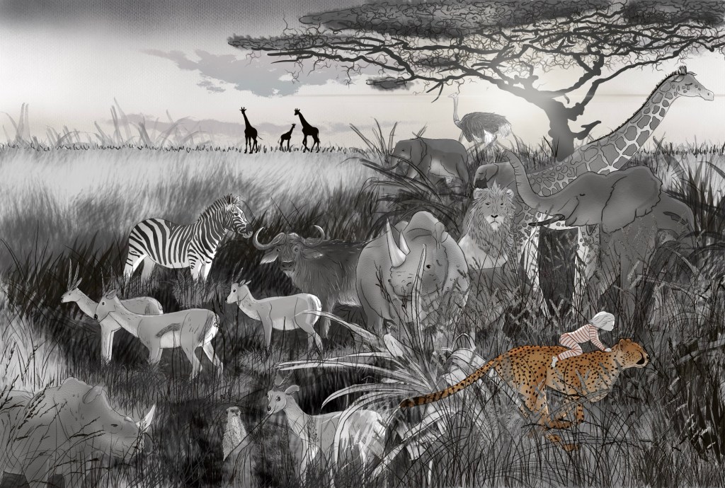
Next tip from my then seven-year-old art director:
“Planets that size have a lot of moons.”
Noted. Drawn. Incredible.
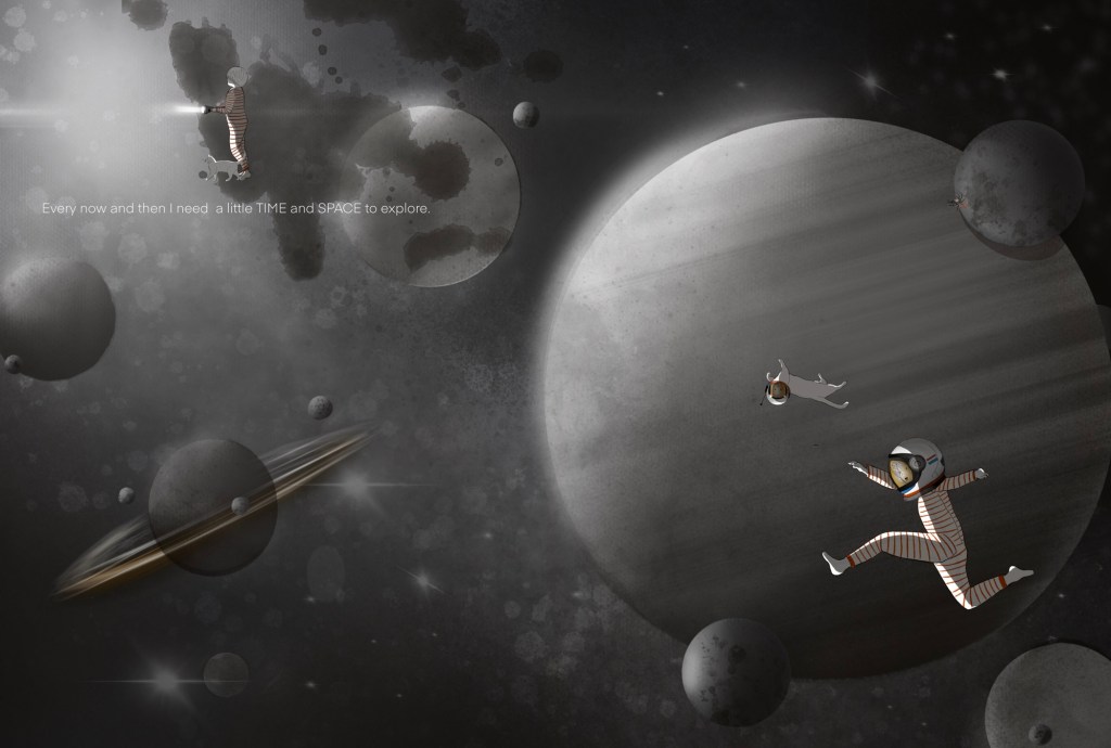
I redrew each page with the same detail using the memories of all three of my children and how we played together. Messy, silly, bath time, cuddles.
Then came Velvet the Spider. Inspired by Finn’s big sister – the ever-watchful, caring, but in-the-background best friend.

In each book I have illustrated I always include a little animal sidekick – otherwise the child looks a bit lonely. Sometimes it’s a dog or kitty – even an iguana. Usually I ask the author to choose the animal. In Always Us there’s a little white kitty and a spider – but you have to look carefully for her; she’s well hidden on each page.
Finally the day came for the Dutch publication. They opted to call it Altijd Wij (Always Us), as Sometimes is just Soms in Dutch and doesn’t have quite the same ring to it as it does in English. I chose to change the English title for consistency.
From moths to shelves, Always Us has been an amazing journey.
Looking back, I’m actually kind of grateful I didn’t win Key Colors. Had I won, I might never have questioned those first illustrations. I might never have listened to Finn’s observations, or trusted Clavis enough to redraw nearly every page. I thought they were changing my book. Instead, they were helping me find it.
Now, whenever I see Always Us tucked onto a library shelf, I don’t think about the contest anymore. I think about a little boy in the red striped romper racing around our house, pretending the floor was lava.
Sometimes the best stories begin simply because you decided to doodle.

